As a regular designer, I’ve always respected Banksy. His pieces look simple — just stencils, silhouettes, and a few words on a wall. But that simplicity is exactly what makes them work so well.
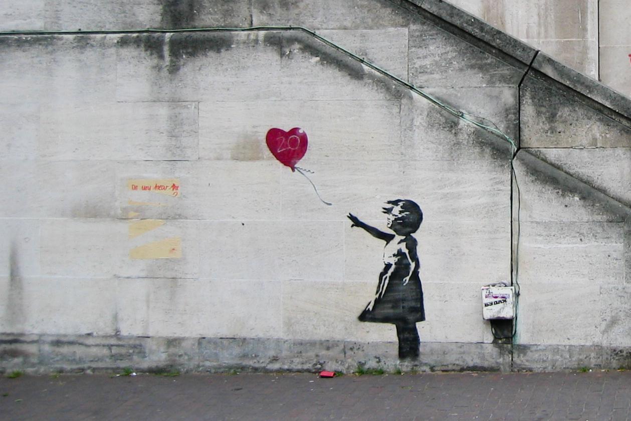
Banksy masters the “less is more” principle. He strips everything down to the essentials: one strong image, a short message, and nothing extra. Girl with Balloon is a perfect example — a child reaching for a floating heart. No fancy details, yet it hits emotionally in seconds.
He also treats the street as part of the design. The location, the wall, and the surroundings complete the message. A rat beside an anti-graffiti sign or a flower thrower on concrete isn’t random — it adds meaning.
His stencil technique is smart too. It allows fast execution while giving his work a consistent, recognizable style. Most importantly, every piece starts with a clear idea. The visuals support the message instead of overshadowing it.
Banksy uses humor and irony to sneak serious comments about society, war, and power into images that first make you smile. In a world of loud advertising, his raw, honest approach cuts through the noise.
At the end of the day, Banksy proves that good design isn’t about complexity or polish. It’s about clarity, context, and ideas that actually reach people.
Simple. Direct. Effective.
That’s why Banksy’s work is good design.